

")
Before I share more about our morning room renovation, I want to take a step back and talk about the design vision for our lake house—because for me, the architecture of a home and the interior design are deeply connected. One influences the other, and when they work together, the whole space feels intentional and flows.
Our home is what you’d call a southern shotgun house: long, narrow, full of charm, with a double-decker front porch that instantly stole our hearts. It’s 20 feet wide and 40 feet long, and though compact, it has so much personality.
The Layout That Makes It Home
The first floor is open concept, but it still has its nooks and crannies that make it feel cozy. The kitchen sits at the back of the house, overlooking the lake. There’s a great dining area that comfortably seats ten (sometimes more!), a full bathroom, and a living room that leads right out to the porch—the best spot for sunrise coffee or sunset cocktails.
Upstairs, the layout originally gave us four bedrooms. We’ve since transformed the bunkroom into my walk-in closet and laundry area (which has been life-changing), leaving us with three comfortable, cozy bedrooms—two of which still have their original closets.


A Unified Design Vision
When we bought the house, I knew immediately that I wanted one main color throughout the home, with the exception of the kids’ rooms. With a house this size—and with so much natural light – using a consistent palette creates flow and makes the space feel larger and more serene.
But choosing the right white? That took a bit of trial and error.
After testing several shades, I landed on:
- Incredible White by Sherwin-Williams for the walls
- Journal White by Behr for the trim—a color I’ve used in our last three homes and still love just as much
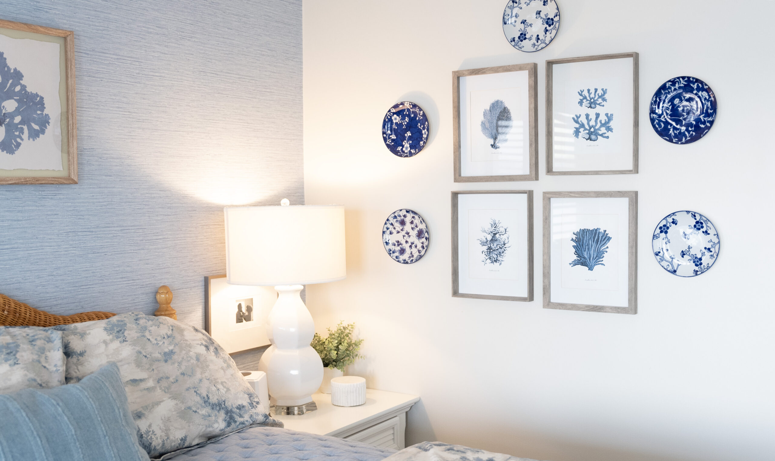
Once the walls were set, I began layering in blues, sage greens, and soft textures throughout the home. Wallpaper became an important part of the story, adding depth and visual interest without overwhelming the space.
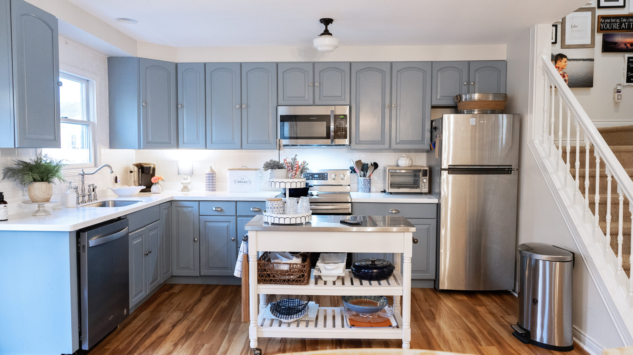
And about four years ago, I took a leap and painted the kitchen in Watery by Sherwin-Williams—a gorgeous, calming sage blue that reminds me of the lake itself. It added just the right amount of personality to the first floor while still fitting into the overall palette.


Designing the Morning Room with Purpose
So when we began dreaming up the new morning room addition, I knew it had to fit seamlessly into the existing color story. This room will become a major walkway into the home, so it needed to feel connected to everything else while still having its own moment.
I stayed with the same palette: shades of blue, soft creams, and natural textures. The goal is for the morning room to feel like an extension of the lake—calming, bright, and cohesive with the rest of the house.
I’ve always believed that good design is about connection. For me, repeating colors and themes across rooms ties everything together and makes a home feel collected rather than chaotic.
How Do You Design Your Home?
Do you like to use one color palette throughout your space to create flow?
Or do you love designing each room with its own unique theme and personality?
I always love hearing how others approach their spaces—because there’s no right or wrong way. Home design is deeply personal, and that’s what makes it beautiful.